Chocolove
Chocolove’s existing packaging featured a number of elements that consumers loved — such as elegant fonts, gold foil stamps, and romantic poems printed inside each wrapper. At the same time, however, Chocolove chocolate bars were difficult to distinguish on a store shelf for a number of reasons. First, the packaging was busy and crowded, with long flavor names squeezed in beside logos, stamps, origin information, and cocoa percentages. Second, the packaging lacked consistency and had no hierarchy in terms of font and style. Lastly, Chocolove’s packaging design was presented horizontally — making it awkwardly placed in retailers’ vertical displays.
Zehnder’s first challenge was to learn more about Chocolove’s target audience and competitors in order to inform a package redesign. Our second task was to utilize this information to draft intelligent, strategic sample package designs.


Zehnder’s research and analytics team conducted a deep-dive study on the chocolate industry, particularly looking at the niche and growing market for premium chocolate. Since Chocolove had not conducted any industry research or undertaken any significant marketing efforts to date, our team’s from-scratch efforts were used to inform business strategy, social media outreach, brand messaging, and more. By considering the creative approach and packaging of Chocolove competitors, we were able to identify concepts that would help the brand stand out to discerning chocolate consumers.
We helped Chocolove get to know its audience through detailed personas and audience research. Knowing that premium chocolate consumers rely on taste, quality ingredients, health benefits, and emotion when purchasing chocolate, we advised the brand to focus on these elements in its packaging and overall marketing strategy. By comparing consumer sentiment for Chocolove versus other premium brands, we were able to identify opportunities for growth and create a distinct look for Chocolove.

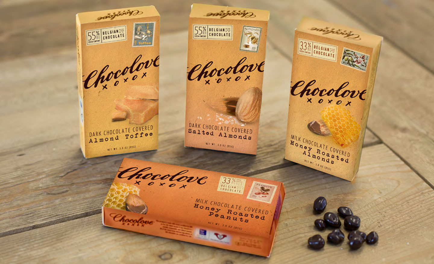
Zehnder recommended new packaging concepts that would help Chocolove stand out against competitors and impress consumers with refined tastes. Our new designs emphasized the quality of Chocolove ingredients, the “better for you” qualities of add-ins like gingers, nuts, and grains, the romance of the Chocolove brand, and the indulgence of the Chocolove experience. We simplified the appearance of the existing packaging, re-oriented text to align with vertical displays, and standardized font styles and sizes. At the same time, we held on to the creative concepts that existing Chocolove fans knew and loved. The result was a cleaner, simpler, and more professional packaging style suited to resonate with Chocolove’s target audience.


